statswork

Stronger Analysis. Smarter Research. Bigger Savings!
Access expert statistical analysis and research support at Flat 24% Off
Stronger Analysis. Smarter Research. Bigger Savings!
Access expert statistical analysis and research support at Flat 24% Off.

Q & A
Data Visualization

Q: How Do Modern Platforms Support Economic Data Visualization and Communication?

Business intelligence for financial analysis

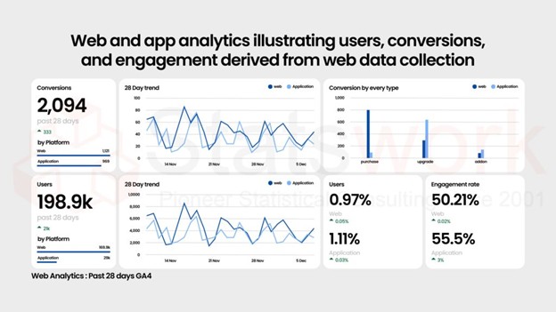
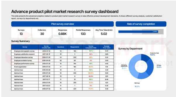
However, the biggest challenge associated with economic data analysis is transforming large volumes of numbers into useful information which can be used to drive decision-making. Alone, numbers do not convince anyone – but with good dashboards or graphs, any complicated trends may become evident within seconds. In the modern world, data visualization platforms provide organizations with tools which will allow them to shift from the stage of raw numbers to creating a coherent and communicative story [1].

The table below lists the most popular economic data visualization platforms together with their main purposes and applications in enterprises.

Platform Comparison immediately

Platform / Library Category Best Used For Skill Level
Power BI & Tableau Business intelligence dashboards Real-time monitoring and executive reporting Low (no-code)
Jupyter Notebooks Reproducible analysis (Python) Forecasting, audit trails, and research documentation Medium (code-based)
RMarkdown Reproducible analysis (R) Policy papers, academic publications, and regulatory reporting Medium (code-based)
Plotly Interactive charting library Embedded dashboards and web-based visualizations Medium–High
Seaborn Statistical plotting library Regression diagnostics and distribution analysis Medium–High
ggplot2 Publication-grade plotting (R) Journal-quality economic and research visualizations Medium–High

Interactive Dashboards: Power BI and Tableau

On financial organizations, government agencies, and global enterprises, Power BI and Tableau continue to be the best options when it comes to monitoring economic factors such as GDP growth rate, inflation, employment, and currency movement. It is at the basic level of business intelligence, which is usually the first enterprise-level analytics investment.

Key strengths:

  • Drag-and-drop design — do not need any programming knowledge to make a corporate dashboard
  • Native integration for SQL databases, Excel documents, and APIs
  • Real-time collaboration allows finance, strategy, and management to work with the same up-to-date data
  • A perfect match for economic indicators mapping, e.g., regional inflation rate or employment map [2]

Example use case:

Element Detail
Dataset World Bank Open Data
Visuals Line charts for GDP growth and regional map visualizations for inflation
Output Interactive dashboard refreshed monthly
Real-World Adoption Used by central banks to visualize retail inflation trends and forecast uncertainty intervals

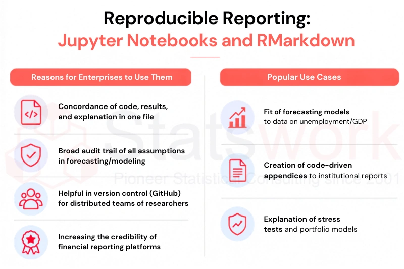
Reproducible Reporting: Jupyter Notebooks and RMarkdown

Where dashboards excel at real-time monitoring, Jupyter Notebooks (Python) and RMarkdown (R) serve a different purpose: reproducible, auditable analysis that supports rigorous financial reporting.

Reasons for enterprises to use them:

  • Concordance of code, results, and explanation in one file
  • Broad audit trail of all assumptions in forecasting/modeling
  • Helpful in version control (GitHub) for distributed teams of researchers
  • Increasing the credibility of financial reporting platforms

Popular use cases:

  • Fit of forecasting models to data on unemployment/GDP
  • Creation of code-driven appendices to institutional reports
  • Explanation of stress tests and portfolio models [3]
corporate data communication tools

Custom Visual Libraries: Plotly, Seaborn, and ggplot2

For teams that need more control over how a chart looks and behaves, these code-based visualization tools offer flexibility that off-the-shelf dashboard software doesn’t always match.

Library Language Strength
Plotly Python / R Creates interactive charts that can be embedded in dashboards and web applications.
Seaborn Python Produces statistical visualizations such as distributions, regression plots, and heatmaps.
ggplot2 R Generates publication-quality charts using the Grammar of Graphics framework.

These libraries are typically used by in-house data science or research teams building a custom analytics platform, and they pair naturally with the reproducible workflows described above.

Bringing It Together: Integrated Corporate Reporting

Usually, the best outcomes can be achieved by using several tools simultaneously rather than using just one. One possible workflow can be described as follows:

  1. Analyze – conduct panel regressions or forecasting via Jupyter or RMarkdown
  2. Visualize – design charts and statistics in Plotly or Seaborn
  3. Present – create interactive dashboards in Power BI or Tableau and present them for executive management [4]

Such a workflow decreases reliance on report-based static analysis and facilitates continuous data storytelling whereby economic analyses can be continuously updated to reflect changing economic circumstances.

Relevance for Enterprises

  • Smooth and faster communication of business analytics with stakeholders and regulators
  • Use of one reliable reporting tool instead of numerous spreadsheet solutions
  • Better governance due to use of reproducible and auditable data communication
  • Better alignment between the company reporting period and real-time economic data

Final Thoughts

Visualization tools in today’s world have transformed the process by which firms turn their economic complexities into actionable insights. Power BI and Tableau facilitate an intuitive monitoring process; Jupyter Notebooks and RMarkdown provide for transparency and reproducibility; while Plotly, Seaborn, and ggplot2 libraries provide the aesthetic customization capabilities required.

Together, these tools form the backbone of effective corporate reporting and data-driven decisions — helping enterprises turn economic indicators into insight that stakeholders can act on with confidence. Choosing the right combination of reporting software and intelligence platform isn’t just a technical decision; it’s a communication strategy

Reference:

  1. Cruickshank, S., McKee, M., & Pagel, C. (2026). Effective communication and public engagement strategies to counter misinformation about infectious diseases. Immunology and cell biology104(2), 92-105. https://onlinelibrary.wiley.com/doi/full/10.1111/imcb.70073
  2. Hossain, M. Z. (2026). Emerging trends in forensic accounting: Data analytics, cyber forensic accounting, cryptocurrencies, and blockchain technology for fraud investigation and prevention. Journal of Artificial Intelligence and Technological Development2(2), 183-208. https://jaitd.com/index.php/journal/article/view/36
  3. Jehangiri, A. I., Lotzmann, U., Räder, P., & Wimmer, M. A. (2026). Data Platforms for Multi-organizational Settings: A Systematic Literature Review with Use Cases and a Reference Architecture. Data Science and Engineering, 1-27. https://link.springer.com/article/10.1007/s41019-025-00329-3
  4. AlMazaedh, I., Tahat, K. M., Alkhalaileh, M., & Tahat, D. N. (2026). Digital religion in platform societies: authority, mediation, and social cohesion in algorithmic publics (2010–2025). Frontiers in Sociology11, 1802281. https://www.frontiersin.org/journals/sociology/articles/10.3389/fsoc.2026.1802281/full